So you have your new battery system ready to save you money from both solar and economy 7. It will be saving you money, but could it be made even more efficient?
At Fuel Included we work with you to monitor your energy profile to make sure you get the most from your investment. If you are not of a technical mind, the key point is that we look at the data and use that information to optimise your system settings.
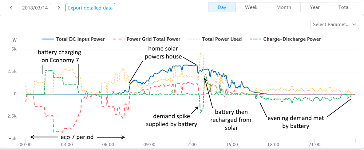
If you would like to dive into the data, check out the example below:

Some interesting things we can see on the graph
- The battery charges (green line) during the cheap rate economy 7 period. Cheap energy!
- Between 6 am and 7.30 am, the grid energy (red line) is still cheap, so the household load is still supplied by the grid.
- At about 7.30, solar picks up (blue line) and supplies the house. However some surplus is generated and being exported to the grid. This is key data for us. As we move from winter into spring and solar generation picks up this tells us it is time to reduce the level of eco 7 charging and leave more space for solar in the daytime.
- At 13.00 a spike in demand (perhaps an oven) exceeds the solar generation. The excess is all supplied from the battery (from cheap overnight energy).
- Once the spike is past, there is space in the battery so it takes the solar excess until the battery is full again.
- As the sun goes down the evening load is all supplied by the battery.
The example above is a newly installed system and so gives us a chance to refine and optimise system settings based on that customer’s real world usage.
Contact us if you would like us to help you in this way.
* ‘Total Power Used’ (yellow line) gives the power used by the household excluding the power passed to the battery
* ‘Power Grid Total Power’ (red line) is what you actually buy from the grid
* ‘Total DC Input Power’ (blue line) is your solar generation
* ‘Charge-Discharge Power’ (green line) is what is going to/from your batteries


